A few months ago I was introduced to the microwave oven sitting in the office kitchen. I had some leftover dinner - steak I think - and I was looking forward to enjoying it, heated, for lunch. Normally thought wouldn’t be required for a task like this, but this time that wasn’t the case. After awkwardly opening the door (hinged to open vertically unlike the usual horizontal type), I was greeted by the following user interface.

Let’s say you want to heat your food for 30 seconds. Where would you start? If you think you know how to get it going… sorry, but in all likelihood you’d be wrong. It took several attempts - probably longer than the 30 seconds my food was to be heated for - to get the thing going. After several more uses, I still don’t know what the magic combination is. I have a theory that it simply waits until you’re frustrated enough. It’s not just me either, reviewers seem to agree with the experience I’ve had. To its credit, it looks OK, and doubles as an oven. Unfortunately, most users won’t care (or even know) - like me, they will simply be frustrated by the needless thought required to reheat their spaghetti bolognese.
There are a lot of great products in the world, although unfortunately, not all of them are easy to use. It’s a shame really, to see products significantly crippled by a few user interface choices. Not everyone in the world is born with a knack for creating, or even recognizing, great user interfaces. I’d like to take some time to address that: I don’t believe that good user interface design requires artistic flair, or even years of accumulated knowledge. I do believe that basic user interface design is very principled, and certainly learnable. I’d like to share some UI design principles that I’ve learnt over time. Hopefully these are helpful to you in some way, whether you’re a developer, designer, or someone with an interest in UI design.
These points aim to remove ambiguity from user interface design, making the subject easier to understand, and less opinion based. I’m not suggesting that you start making UI decisions in place of a designer, but I am suggesting that you use this knowledge to improve the decisions that you already make (after all, a large amount of UI decisions end up in the hands of a product manager or software developer, and a little more know-how when making these decisions could go a long way). There are enough substandard user interfaces in the world already - my aim is to help us create great ones instead.
The Definition of a Good User Interface
Every UI principle I’ve learnt can be derived from the following statement: Good user interface design minimizes the friction between a user and the task they aim to achieve. In other words, well designed software makes it easy to achieve a task.
The below principles are an assortment that I’ve learned over time. Sometimes, a principle can be broken, although the reason for breaking it probably comes back to this definition. It’s a little like music, where there are many rules… but sometimes you can break them if it’s for the right reason. If in doubt, sticking to the rules is fine.
Consistency Matters
A good user interface is consistent with itself. Elements are aligned along common edges, font sizes match, and spacing is equidistant (or perhaps obeys some reasonable set of rules). There is a common color theme, and each element is designed with every other element in mind. It’s not always an easy thing to achieve, and it can be easy to dismiss this task as unimportant. To some, it may not even seem to be something that ‘reduces friction’.
Imagine the polar opposite of a consistent interface, where no element is consistent with any other, and there is no intended reasoning behind the differences. Either consciously or subconsciously, looking at the interface will prompt you to think more than you should have to. Finding the element you want will be harder. You might wonder if there’s meaning behind the oddities that you notice, increasing the visual complexity and cognitive load required to navigate the interface. Just for kicks, here’s a fully inconsistent user interface…
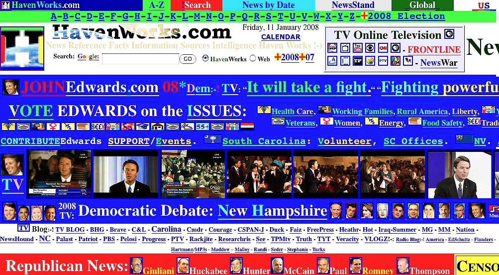
Every inconsistent element, even if only slightly out of place, promotes this effect - and so avoiding this completely is worth it. Imagine a garden full of weeds: one small weed might go unnoticed, but an overgrown garden is an eyesore. So it is with user interfaces, where inconsistencies are like weeds. It’s easy to say ‘it doesn’t matter’ to a small UI inconsistency, but if this decision is the status quo, it won’t be too long before the garden is overgrown.
Don’t Reinvent the Wheel
Users have already been trained to recognise and use various UI paradigms and concepts: iPhone owners intuitively know that text or images coloured with an app’s primary colour (e.g. blue) are tappable elements; Mac users know that holding the shift (or command) key allows you to select a group of elements; and Android users expect that tapping on a triple horizontal line (i.e. a ‘hamburger’ icon) will procure a side pane. By using these pre-established patterns, you can decrease the amount of concepts that are new to the user, greatly reducing the total learning curve.
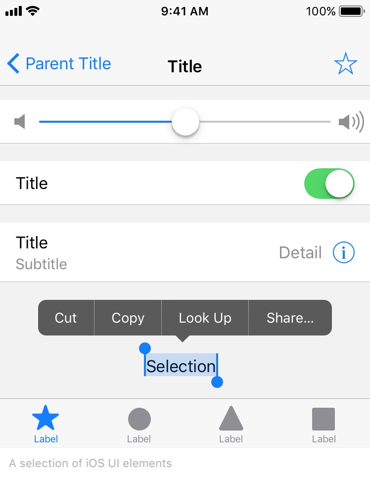
I’d suggest investing time to learn more about the platform you are designing for: What do users already know? What has been already been solved in a way that is intuitive to users? If you’re an iOS designer or developer, Apple has a great resource on the topic: iOS Human Interface Guidelines. Other platforms, such as Android and Windows, have similar resources.
Sometimes, products do reinvent the wheel, but it’s often in favor of the first principle discussed. When the todo list app ‘Clear’ was first released (pictured below), many of the user interface concepts used were brand new to iPhone users. However, a clear tutorial - pardon the pun - and an intuitive, well designed interaction pattern meant that the initial learning curve was well worth the effort. After only a short tutorial, users could manipulate their task list very easily, and so overall, the friction between user and task was reduced. Learning curves are OK, only if it pays off in the long run. You don’t want to introduce a learning curve if it offers no real benefit.

Less is More
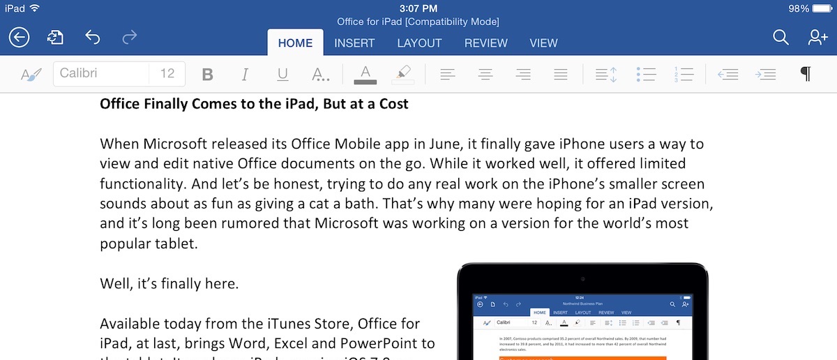
In the name of making every task easy to achieve, it’s easy to just ‘add another button’. Every time you do this, you increase the cognitive load on the user. I still think Microsoft messed up pretty well here:
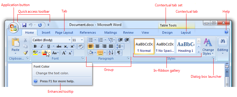
To remedy situations like this, you can nest tasks, limiting the number of choices (and cognitive load required at each level). For example, instead of presenting sixteen buttons to a user, you could present four categories, where each category then lists four of the options. The tricky part here is categorising tasks, because you need to split the categories in such a way that it will be very obvious to the user which category their intended task resides in. It’s worth spending time to get this right.
Microsoft’s ribbon does nest tasks, but the choice to display both the nesting and the categories all at once increases the visual complexity significantly. I’m also not entirely convinced about the choice of categories: more than once, I’ve had to look in several categories to find the desired option. The tablet variant of the ribbon, to its credit, has taken the same concept and simplified it a great deal - which actually seems to work pretty well.
Remove Menial Tasks
The less a user has to do to achieve a task, the better. This could be as simple as removing an unnecessary tap, or autofilling a form with information that you do have. Providing too many settings or options is a common mistake; every option you give users increases cognitive load and makes tasks harder. As shining example of making sure a task is simple is Google’s search form. It wouldn’t be hard to add a multitude of options and features, but Google has resisted this direction in favour of a single, seemingly magical text field (and two buttons - although these are not usually required).

You are Not the User
While succinct and perhaps obvious, this might be one of the most important points here. It’s easy to forget that you are (probably) not the target user. The target user doesn’t know anywhere near as much as you. In fact, it’s often best to assume they know almost nothing, because this will be entirely true for new users.
The above are just a few UI principles, and by no means an extensive or complete list. If in doubt, the definition of a great user interface should help you make good UI decisions.
As food for thought, how would you design the UI for a microwave oven? If you’re stuck, try starting with a generic microwave UI, and improve it from there. You might even be able to use a few of the above principles to help!
